
Xiaomi®
My Role
Project & Design Lead
Owned the project from competitive pitch to final delivery for Xiaomi’s quality department campaign. I led the proposal strategy, client communication, contract negotiation, creative direction, and end-to-end design execution, guiding the team to develop a complete campaign identity system across logo, IP character, key visual, badges, lanyards, and plush toy applications.
Team
Yixuan Wang
Wei Zhuo, Graphic Designer
Ping Long, 3D Modeler
Timeline
Jun. 2021 - Sep. 2021
01
Key Visual Design
Quality Department Background
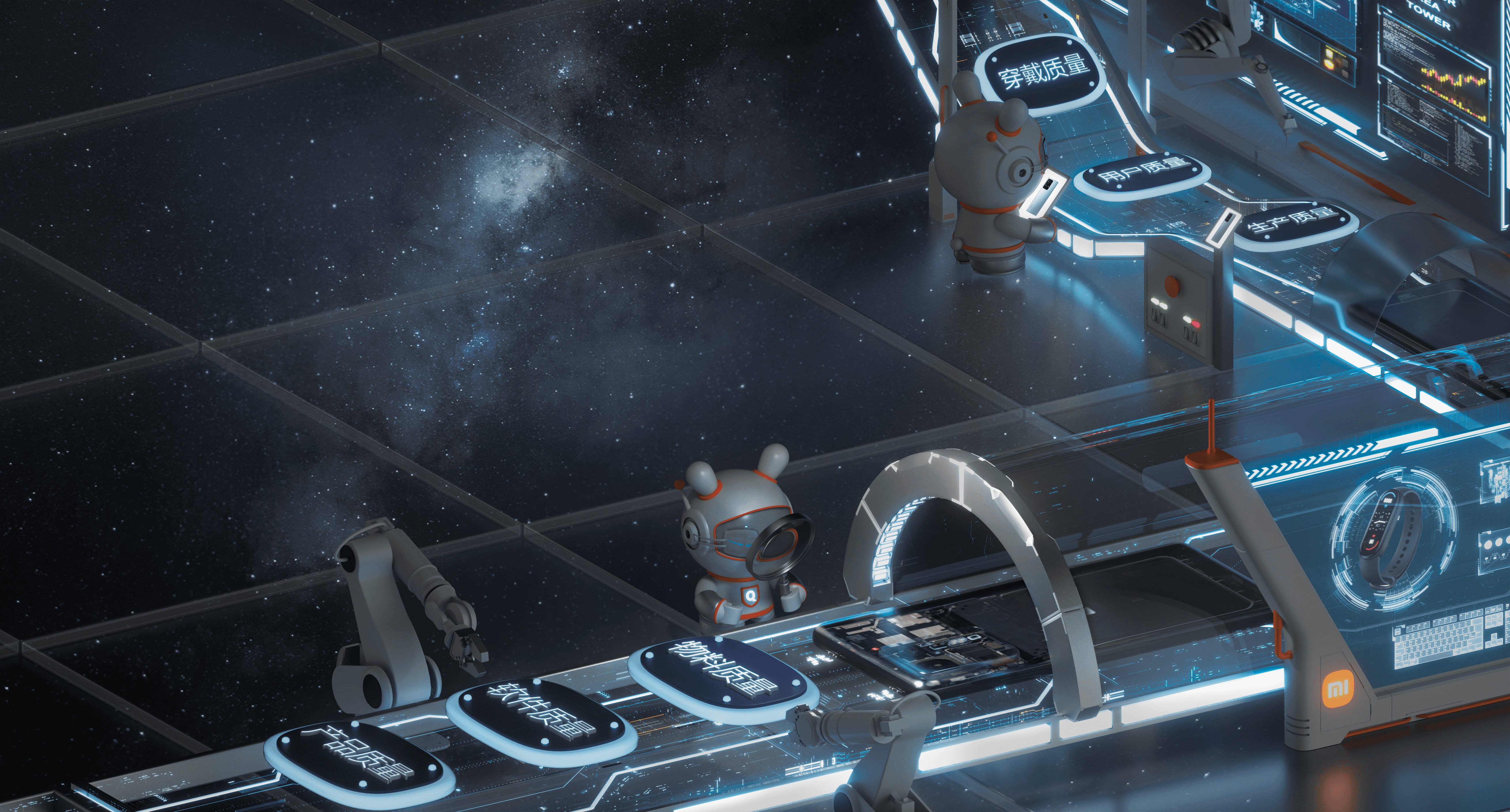
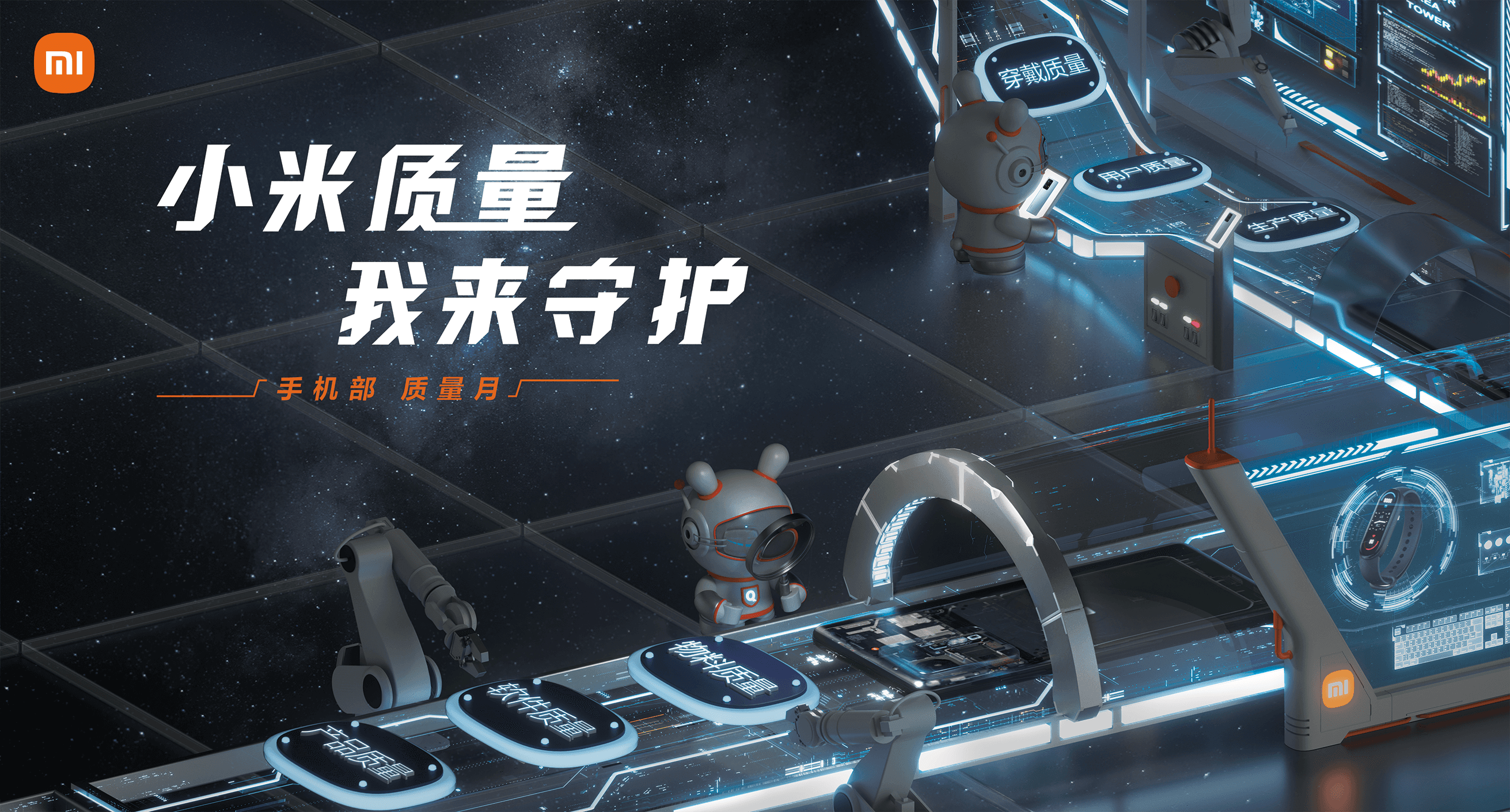
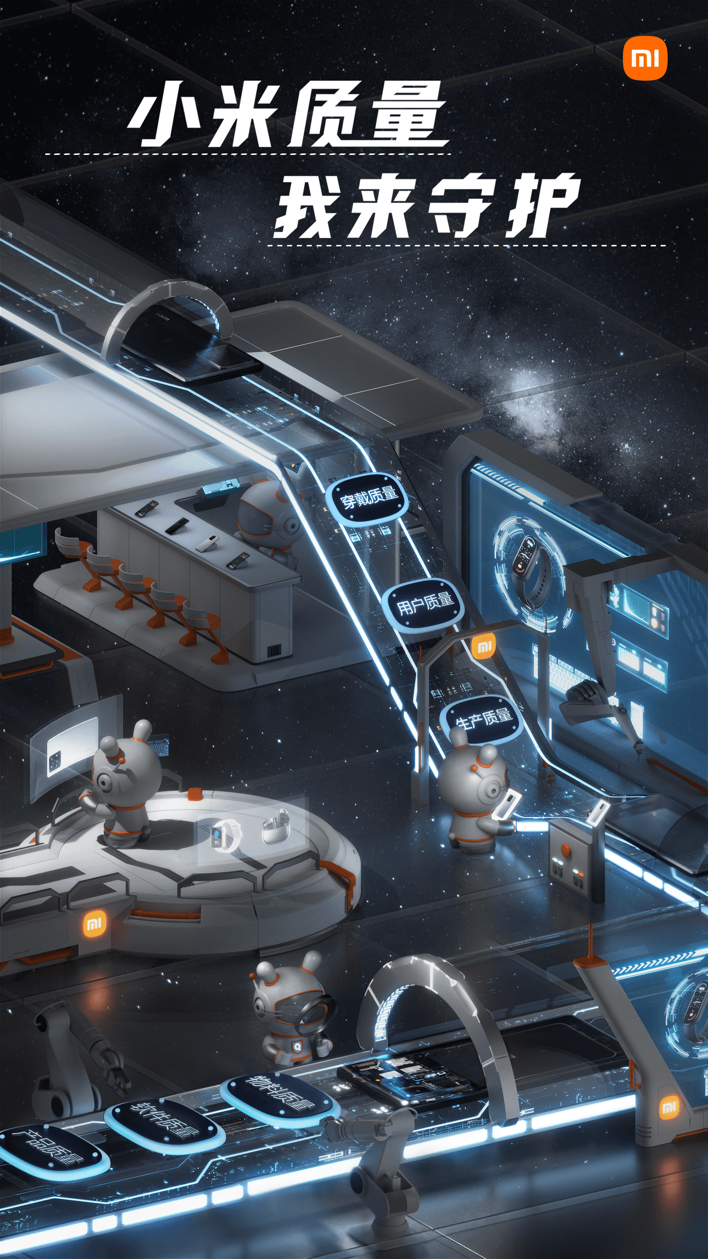
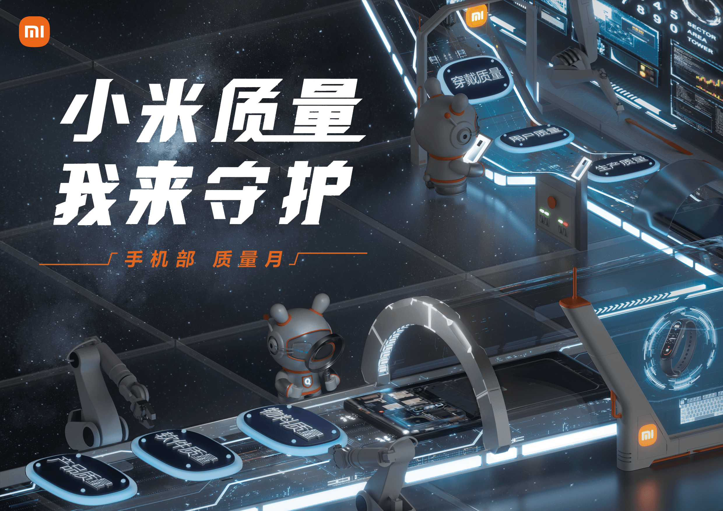
The key visual presents Xiaomi Quality Department as a futuristic quality-control station, where Mitu monitors product, software, material, production, user, and wearable quality. The space-inspired scene reflects the clean, precise, and dust-free standards of modern manufacturing, while the production line, product screens, phones, and chip modules represent Xiaomi’s wide product ecosystem. Mitu’s magnifying glass highlights the campaign message: Xiaomi protects quality by paying attention to every detail.
02
MIPhone Quality Logo
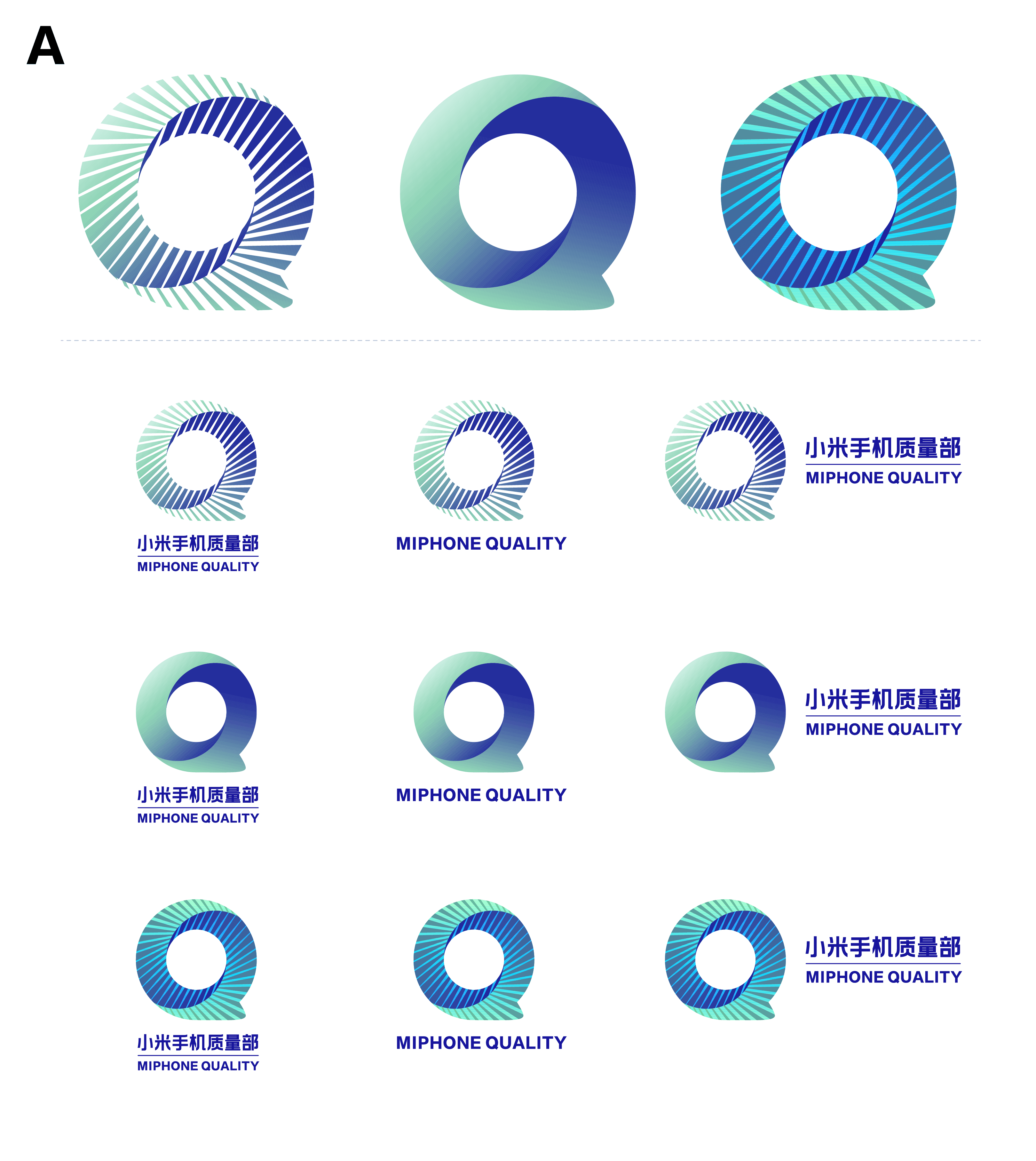
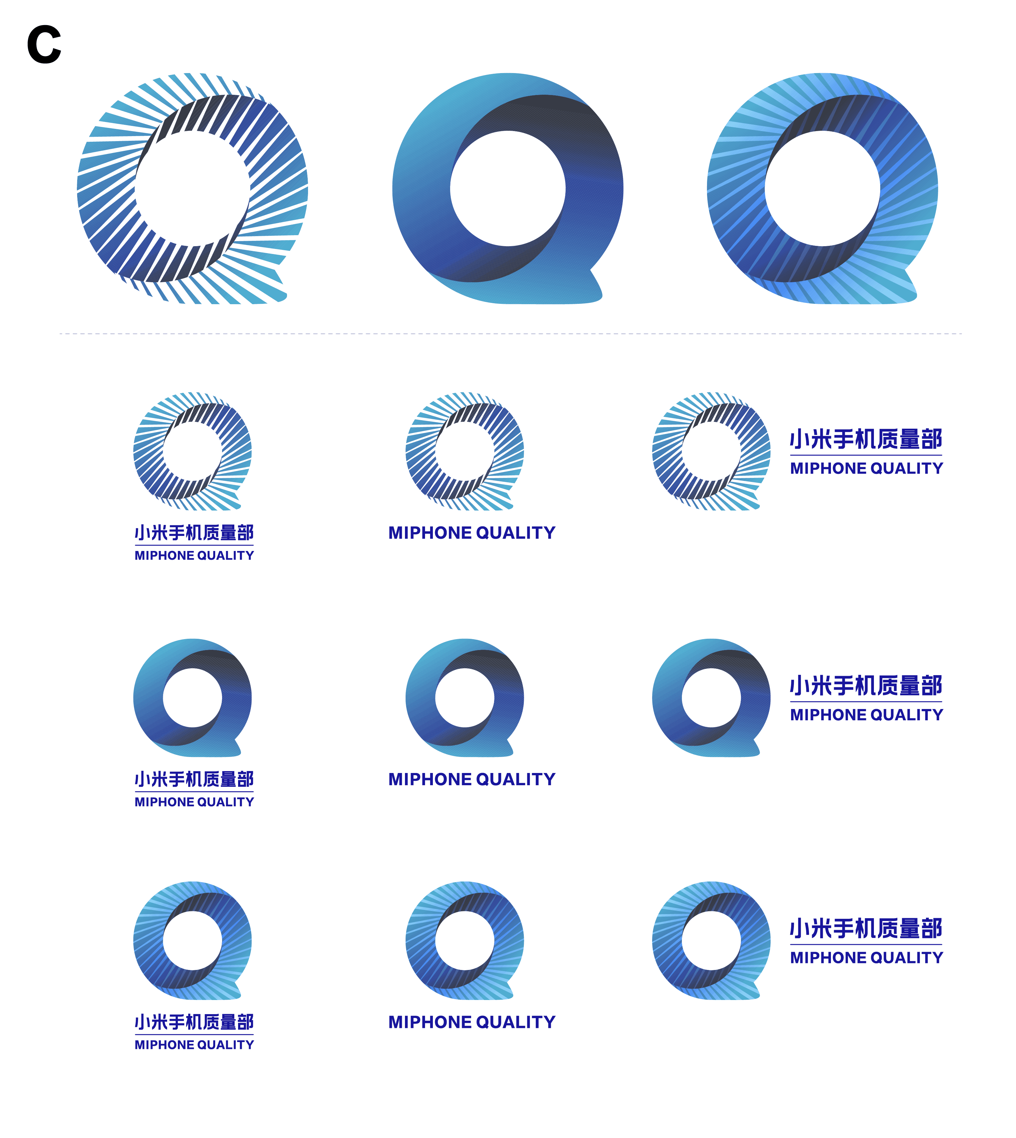
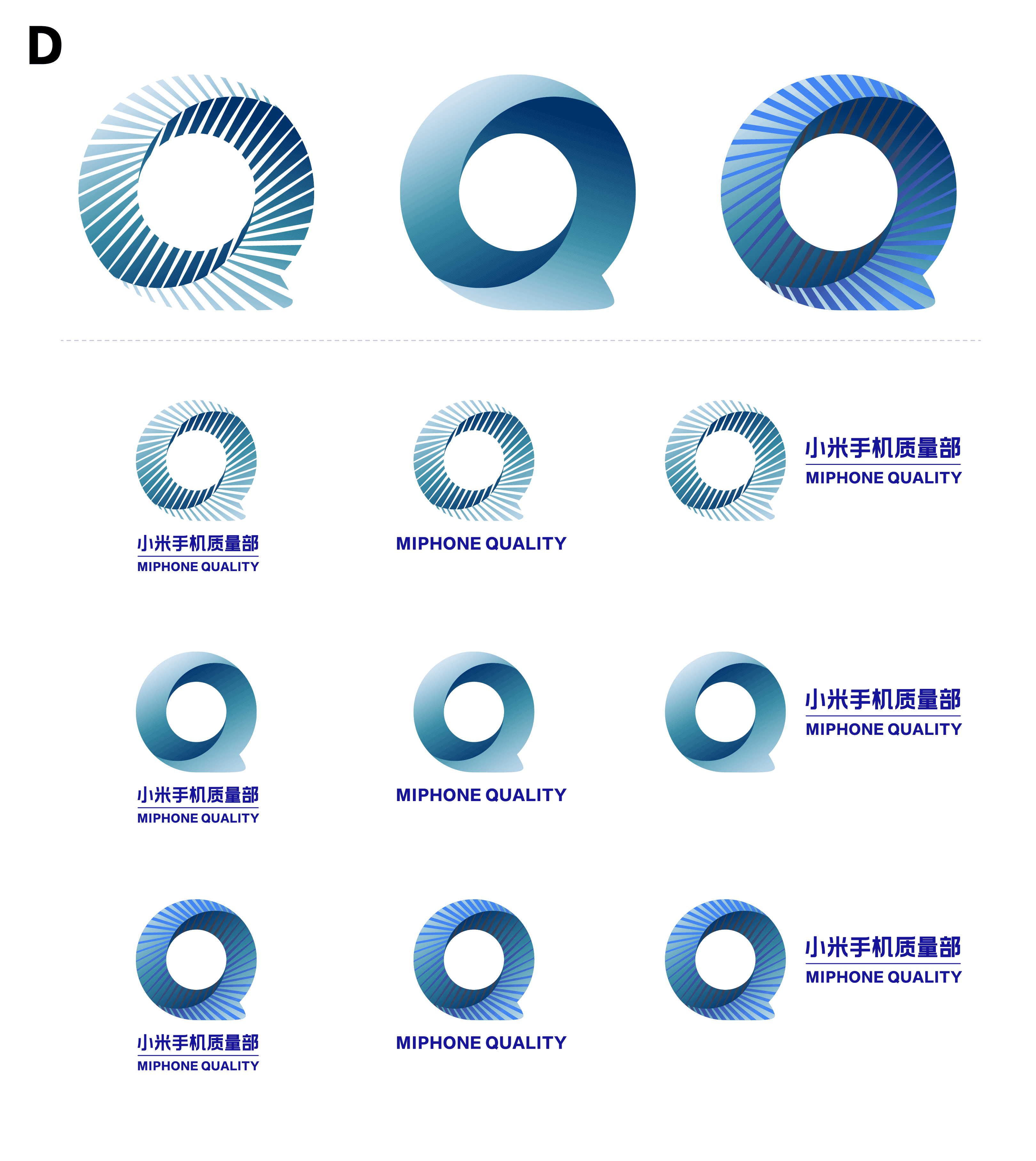
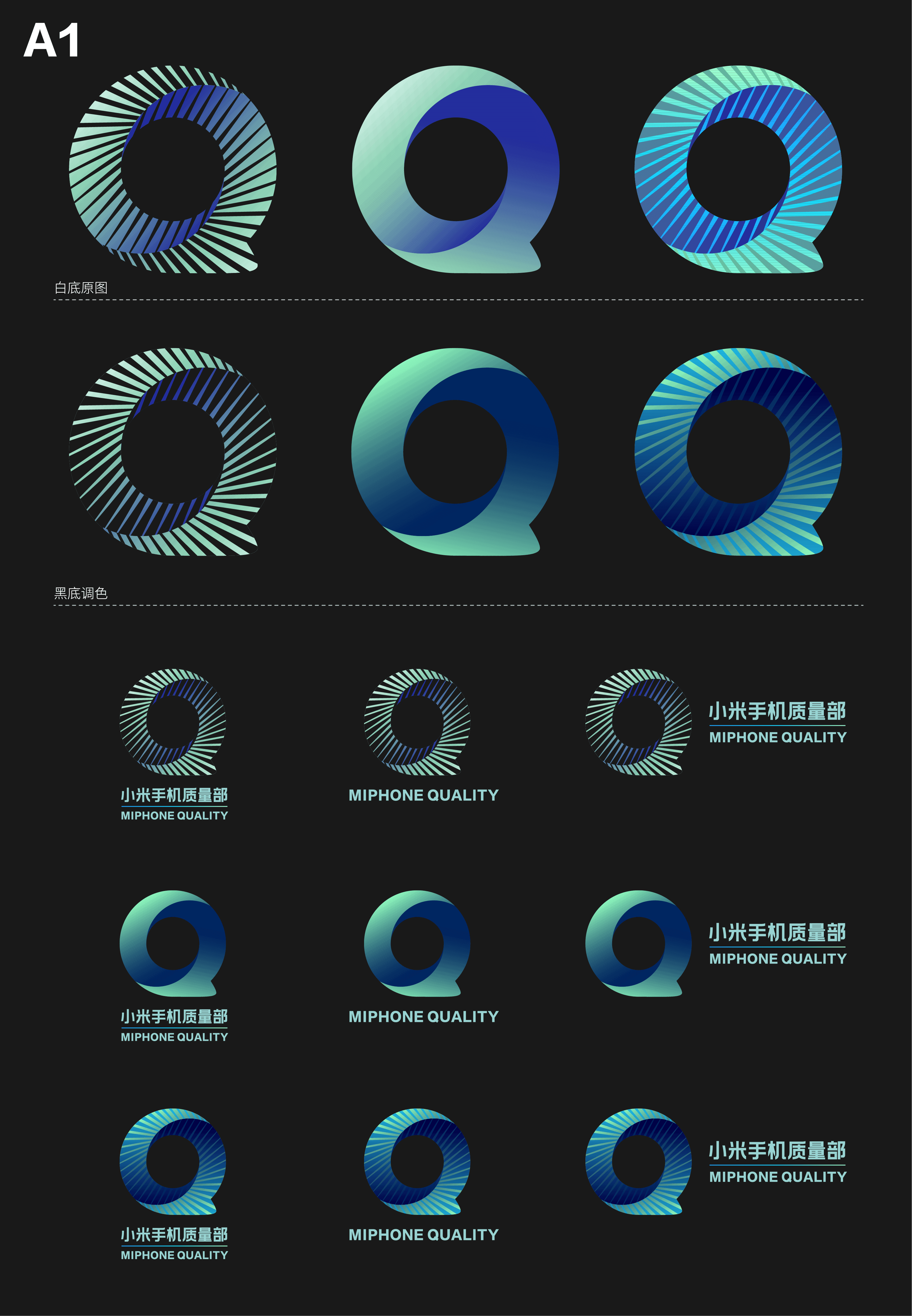
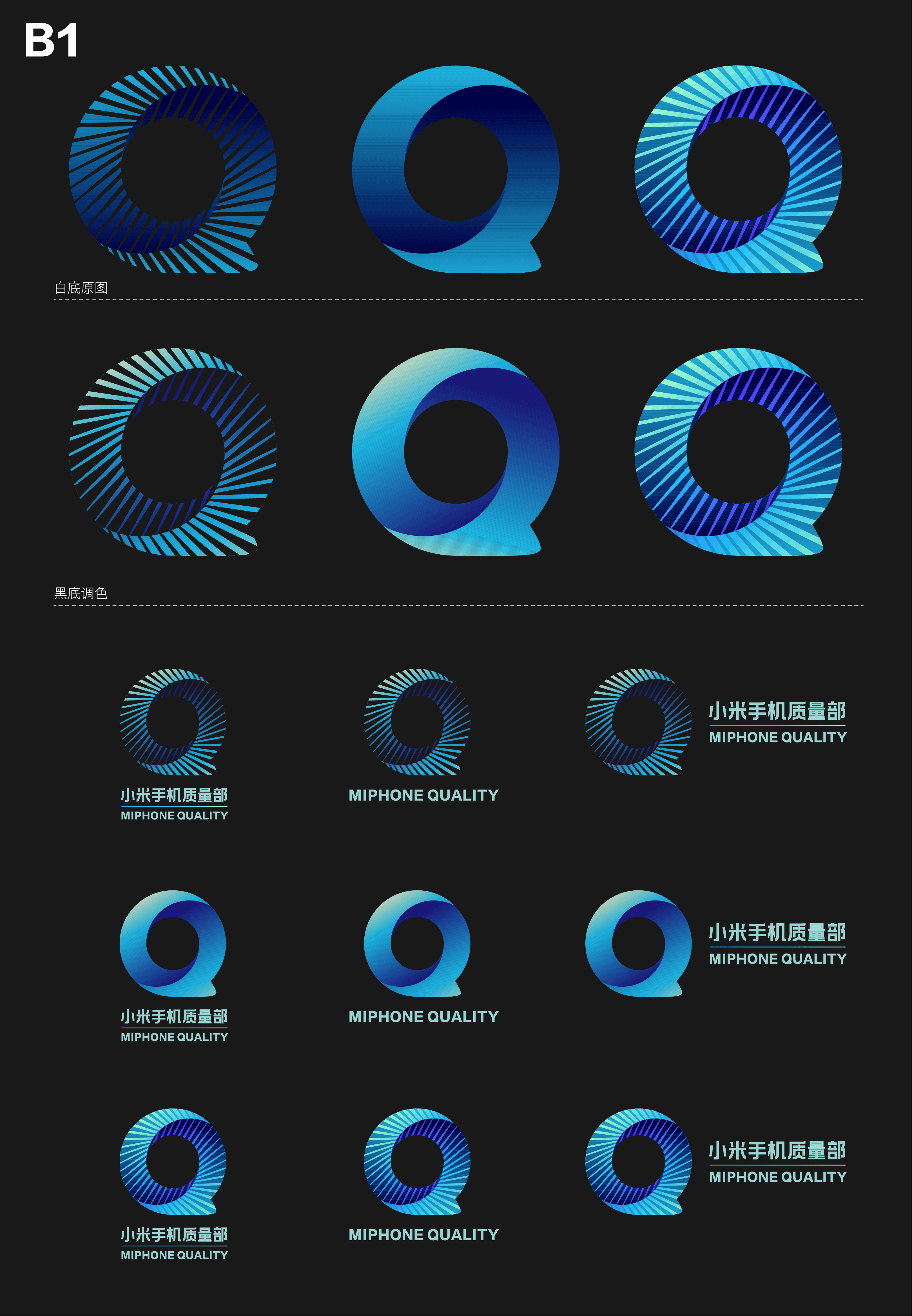
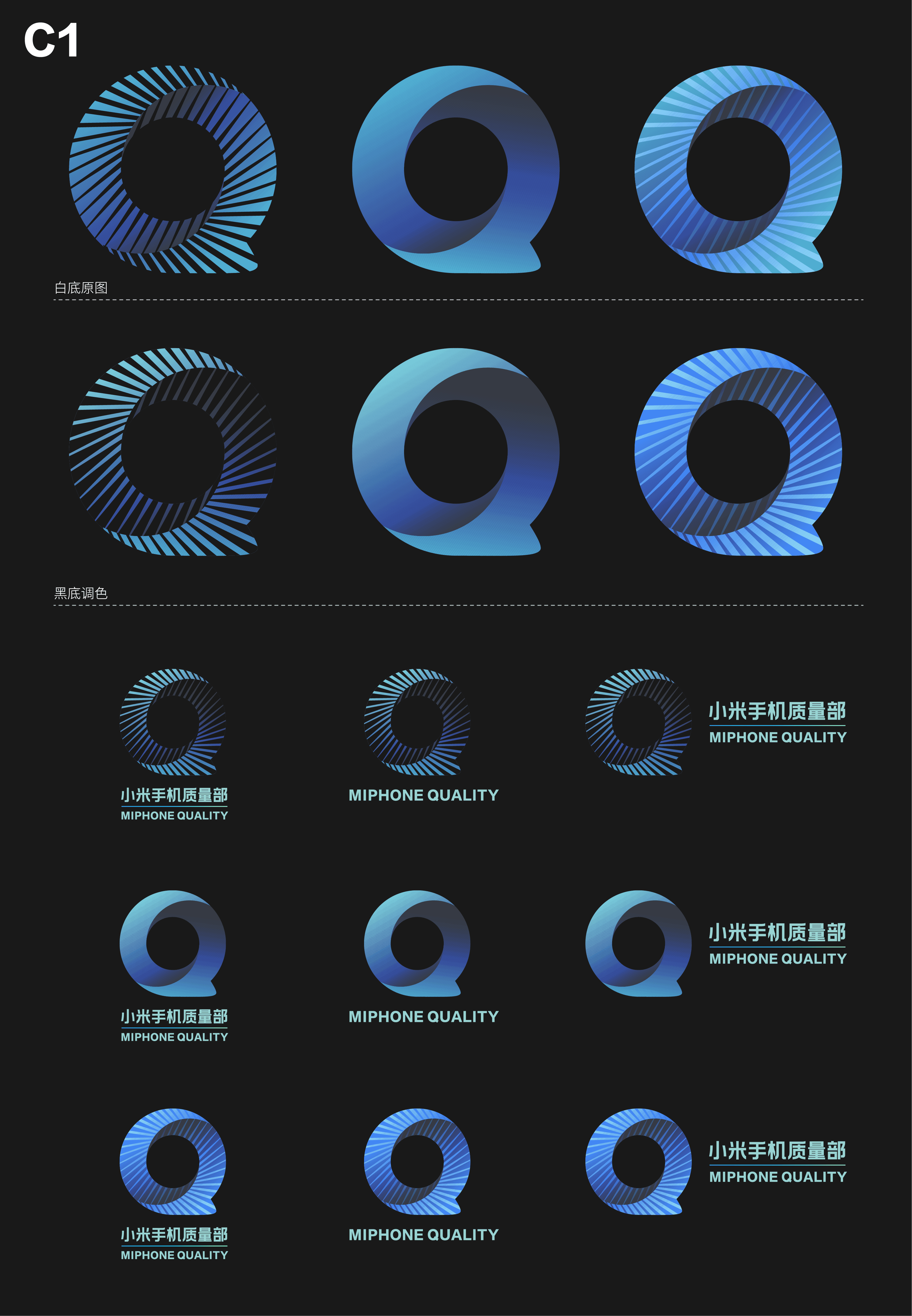
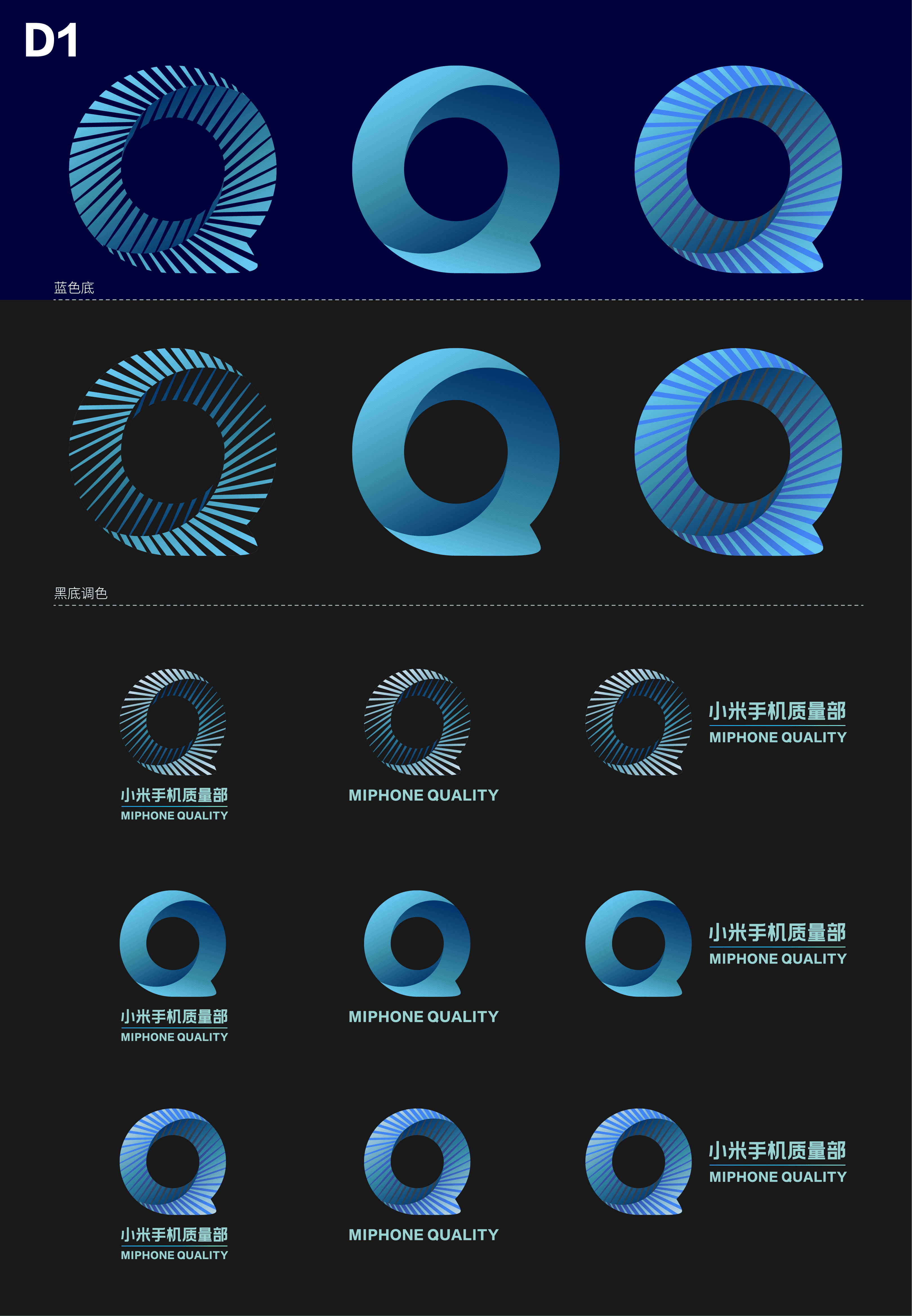
Quality "Q"
The logo is built around the letter “Q,” representing Quality as the core identity of the department. Its circular form also suggests infinity, reflecting Xiaomi’s continuous pursuit of better quality. The stepped structure inside the mark represents a step-by-step quality control process, where every stage needs careful inspection before moving forward.


03
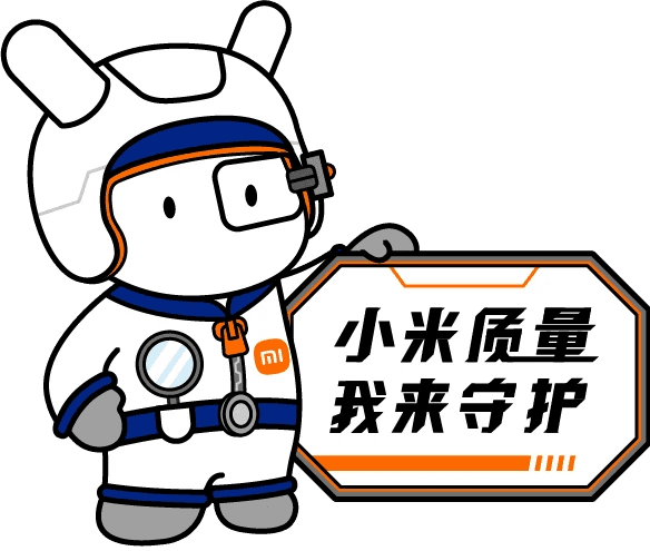
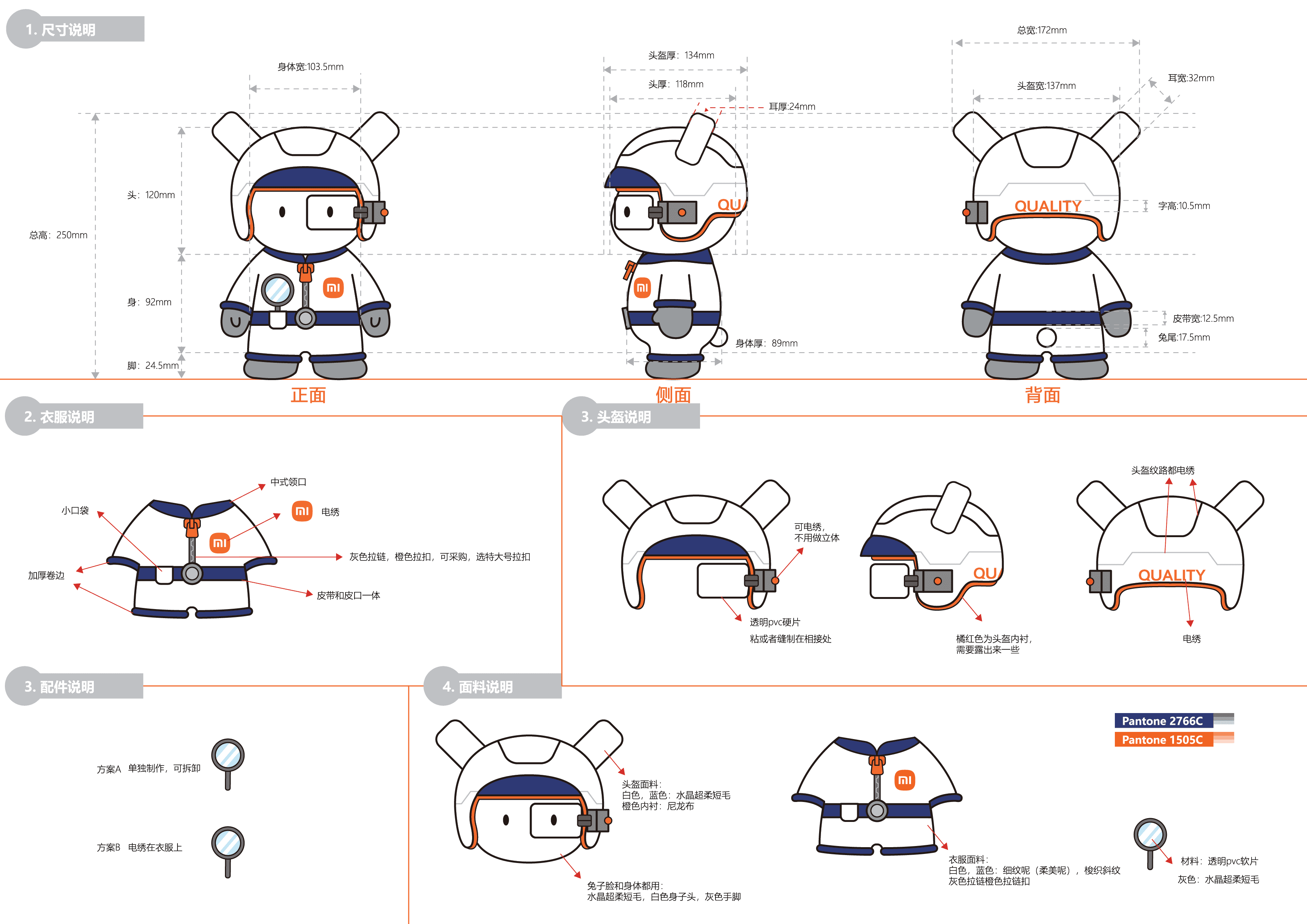
Quality Guardian MiTu
About the Mascot
Mitu is Xiaomi’s official mascot, named after “Mi” and “Tu,” meaning millet and rabbit in Chinese. The original character carried Xiaomi’s early brand spirit through its Lei Feng-style hat, red star, and red scarf, symbolizing a young and ambitious company.
To make the campaign more recognizable, we transformed Mitu into a “quality guardian.” The helmet, inspection glasses, and magnifying glass visually connect the character to inspection, precision, and detail-oriented quality control, making the campaign message easier to communicate across different brand touchpoints.

04
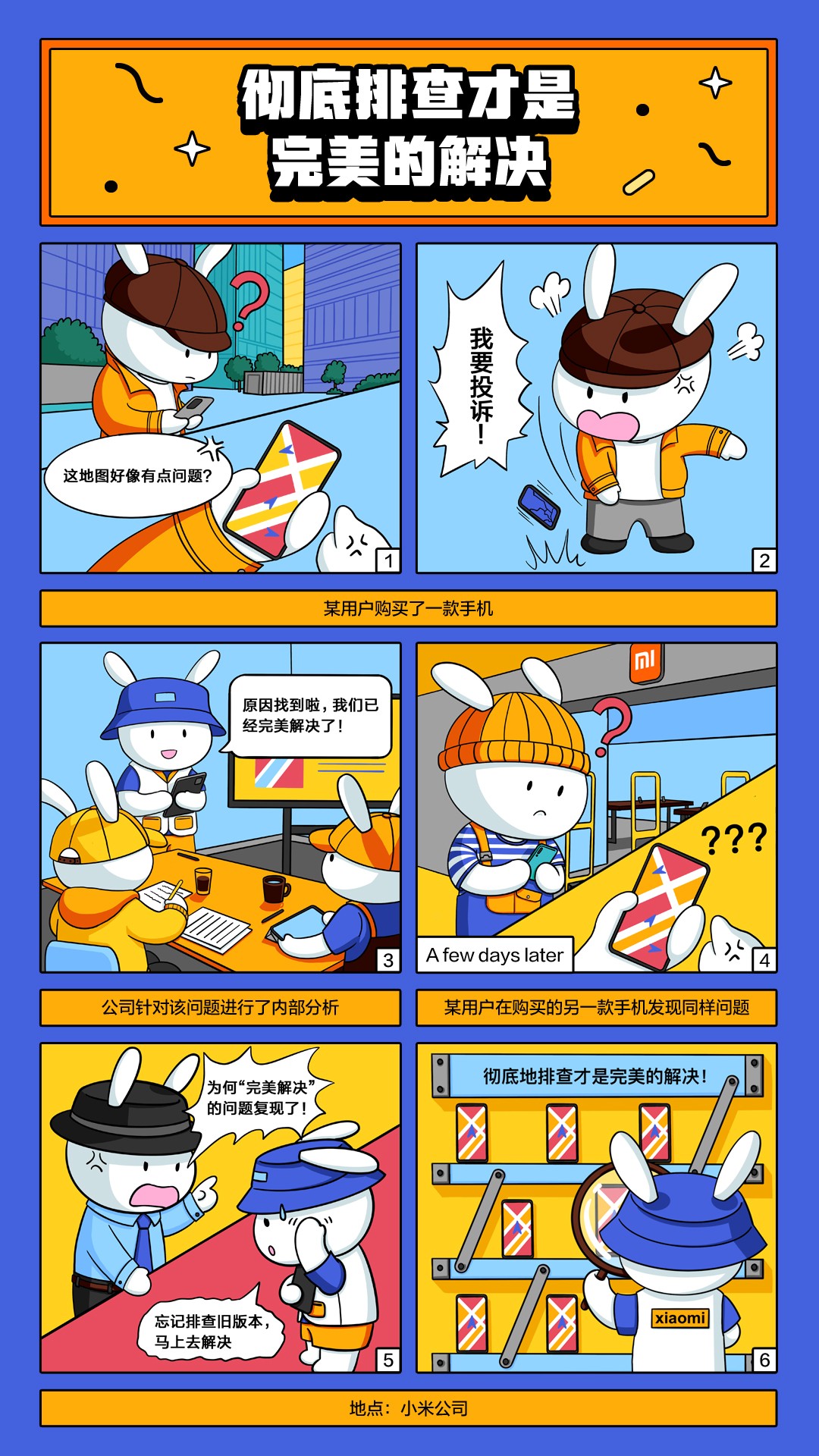
MiTu Comics
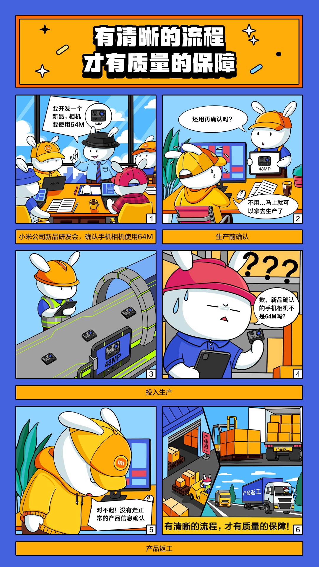
This comic explains that reliable quality depends on a clear and well-followed process. By showing Mitu checking each production step, the story makes process control easier to understand and remember.
This comic focuses on problem-solving in quality management. Through a small product issue, the story shows how careful inspection and root-cause analysis can lead to a better final solution.
05
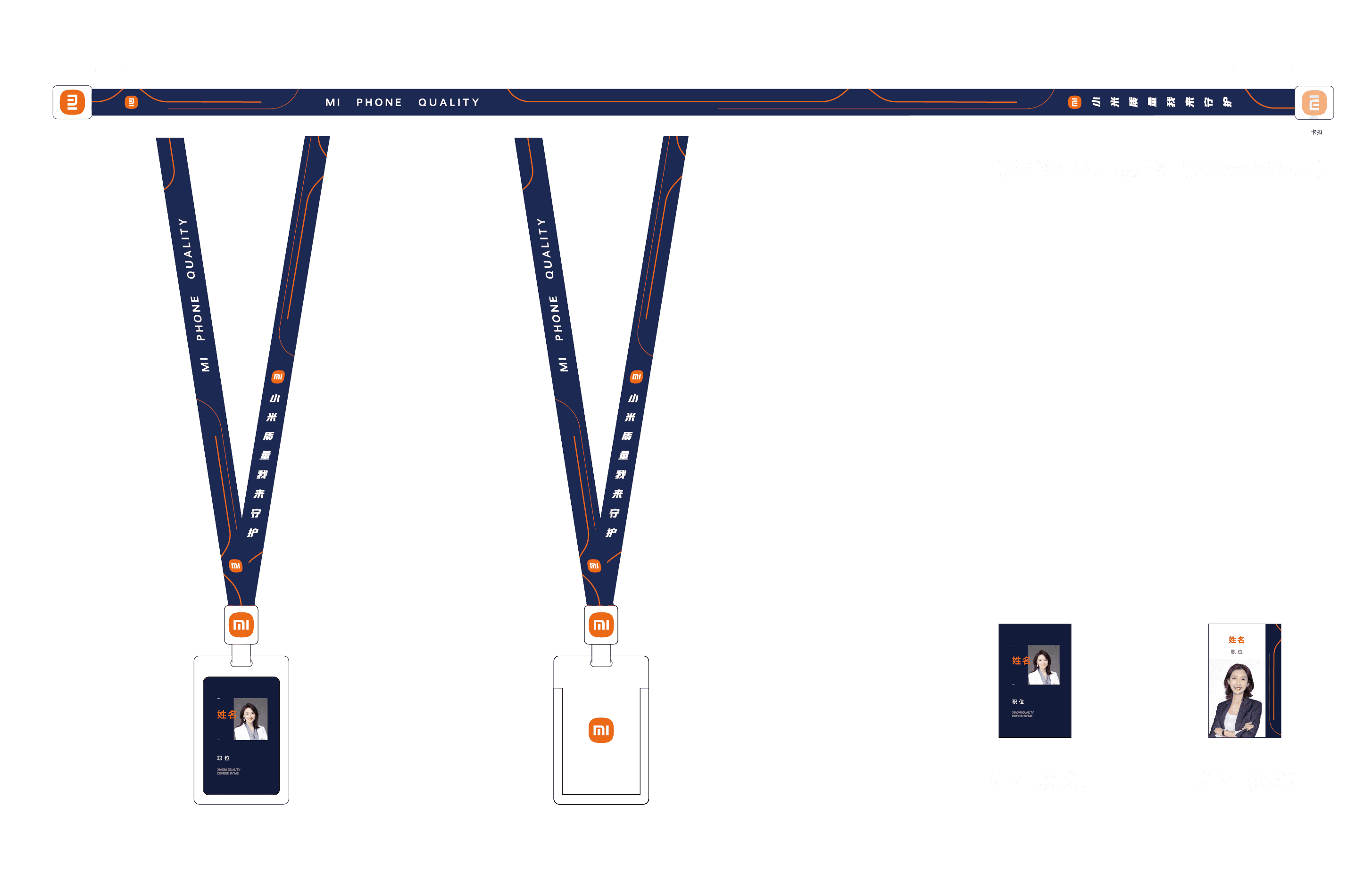
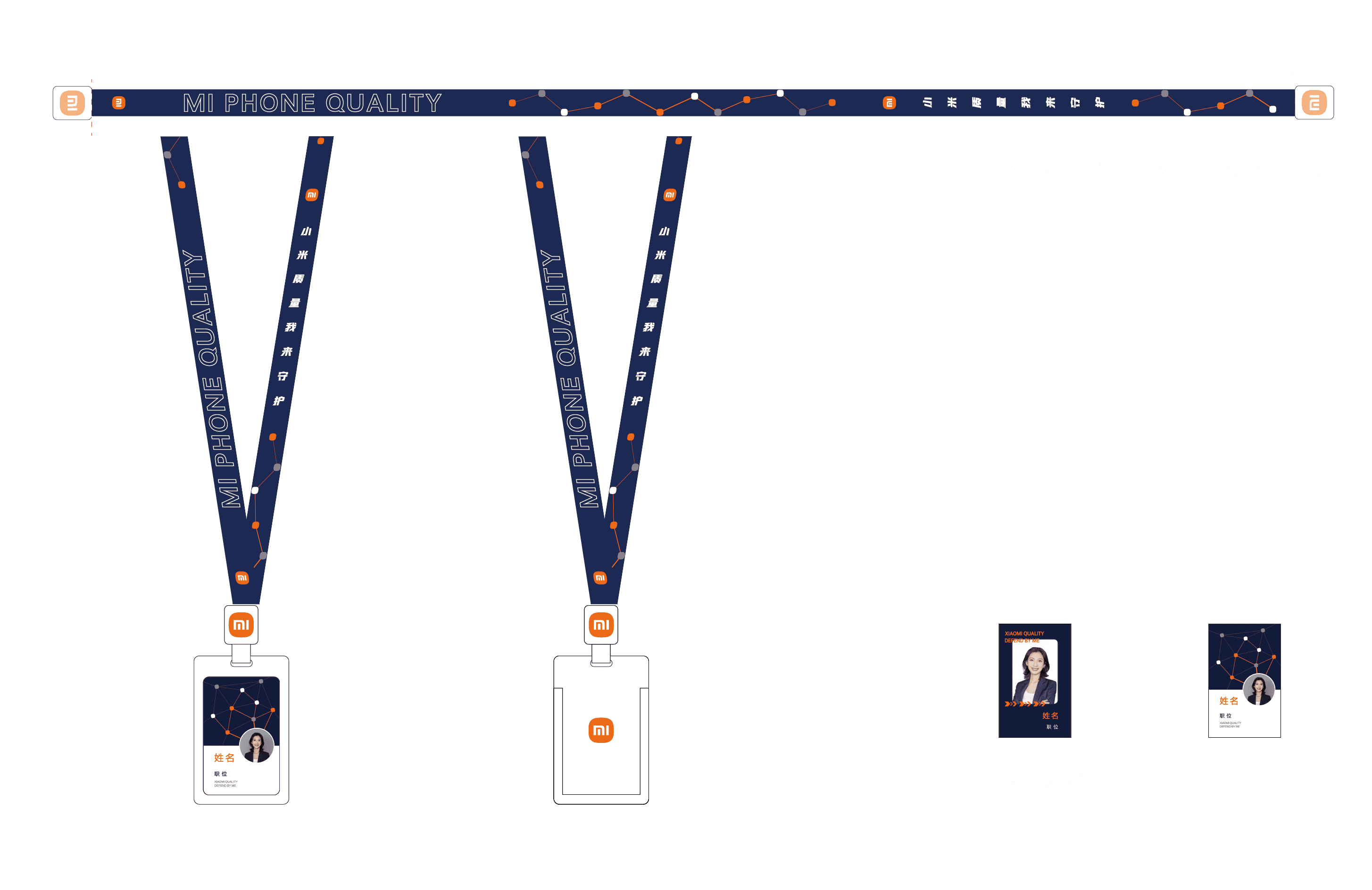
Badge & Lanyard
06
Collaterals
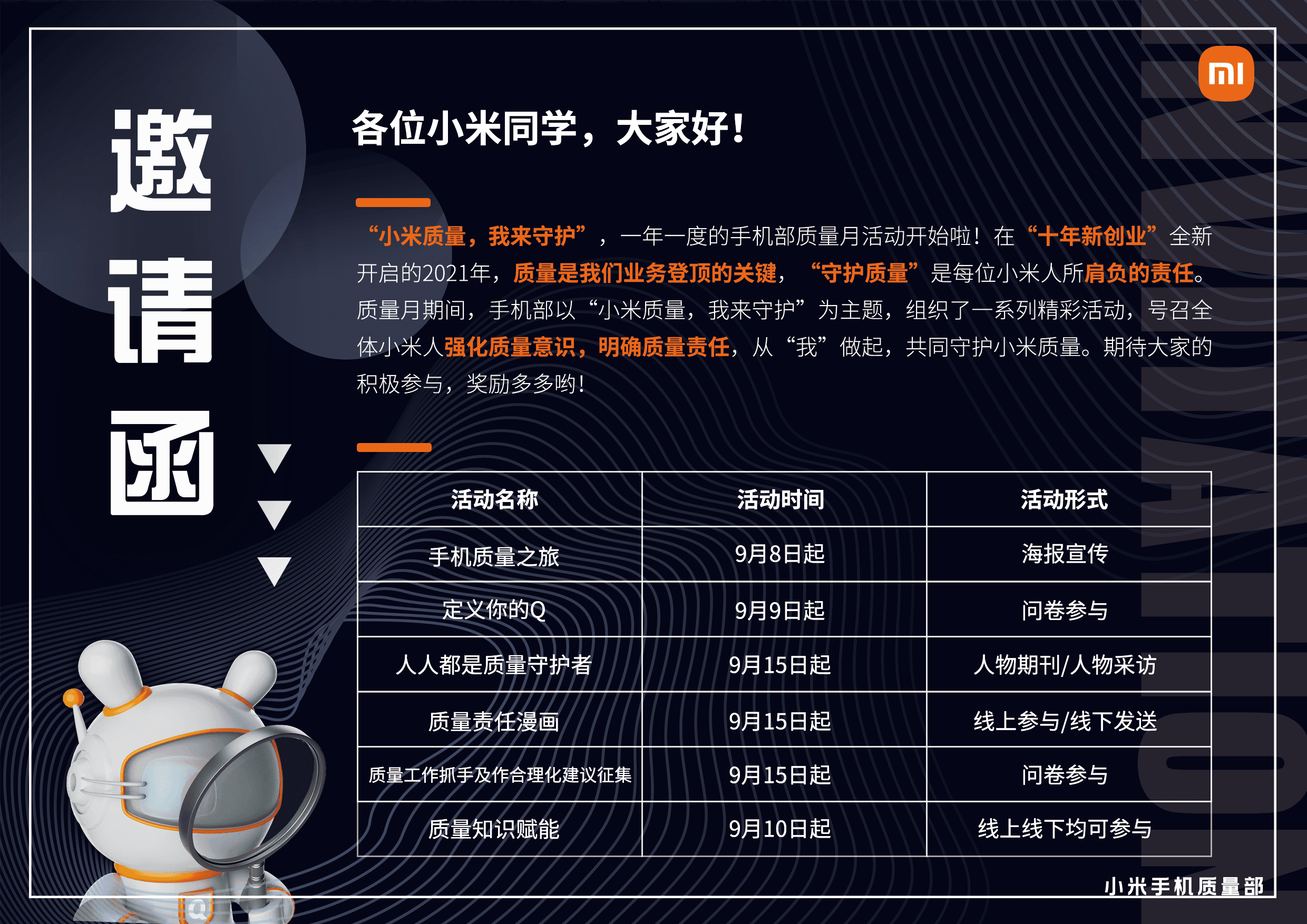
Designed as an internal event touchpoint, the invitation card extends the main key visual into a clear communication format. It introduces the Quality Month schedule while keeping the futuristic, technology-driven visual language consistent across the campaign.
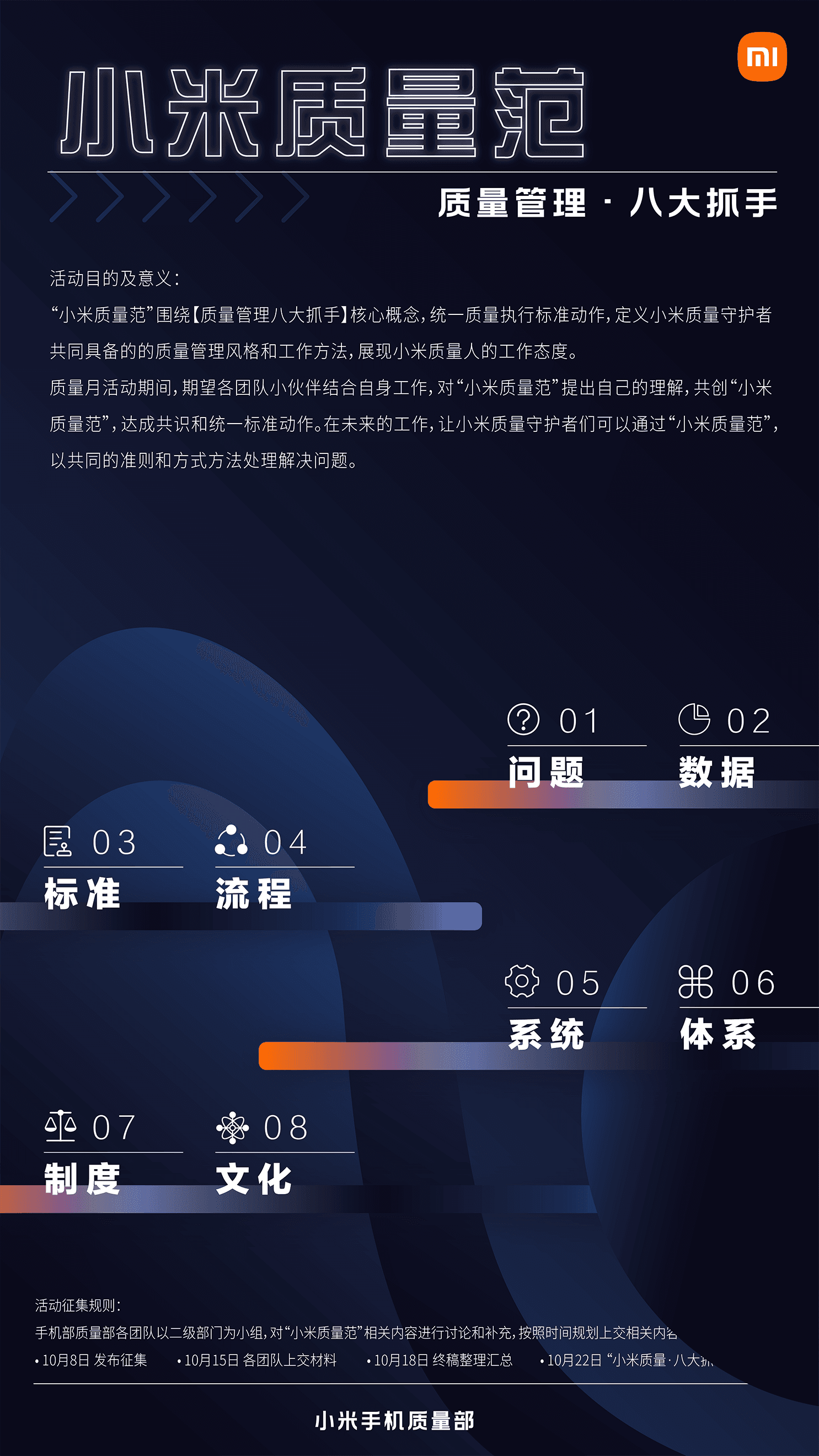
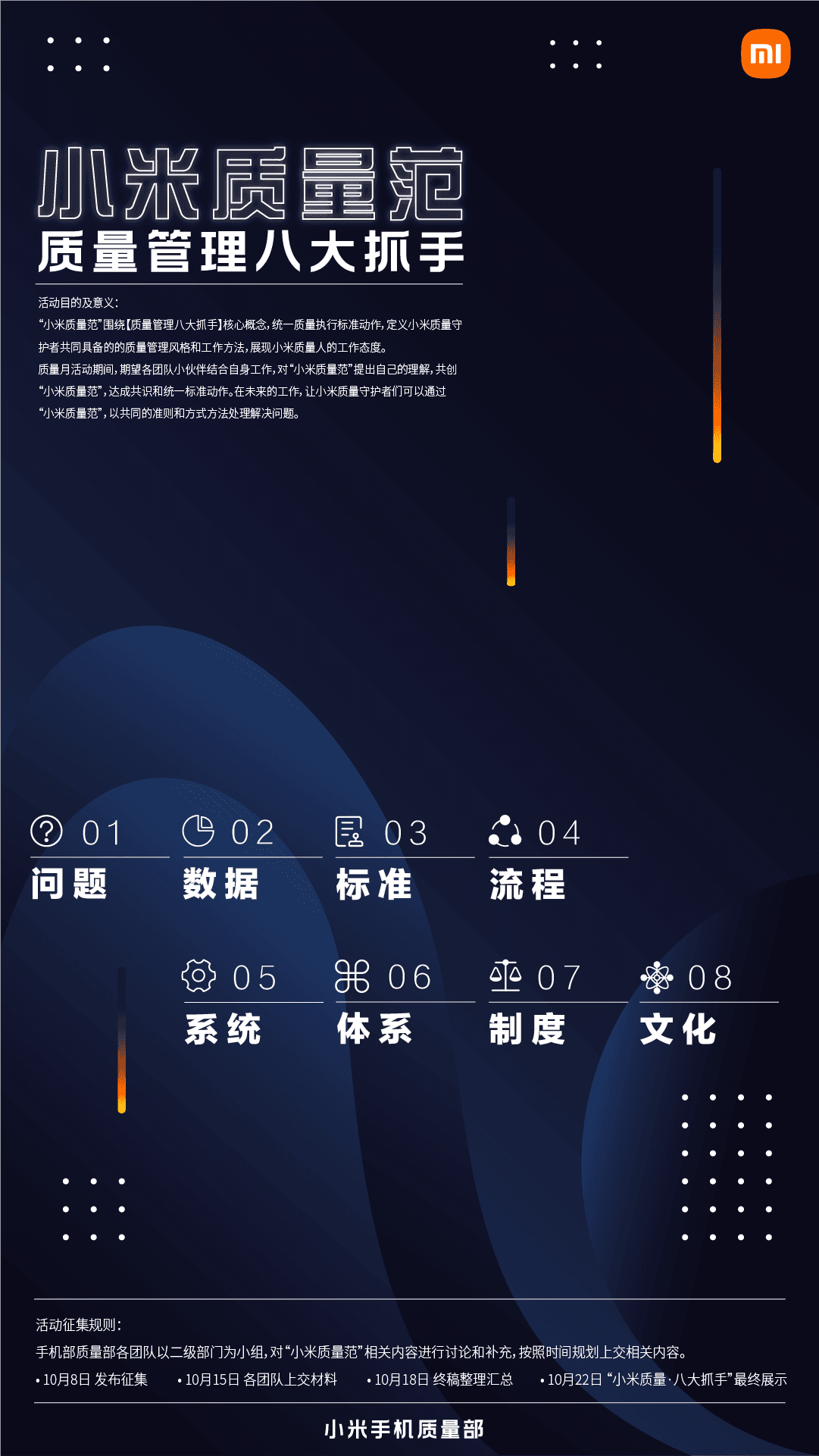
Translated key quality principles into a clear visual framework, helping employees understand the standards, process, system, and culture behind quality management.

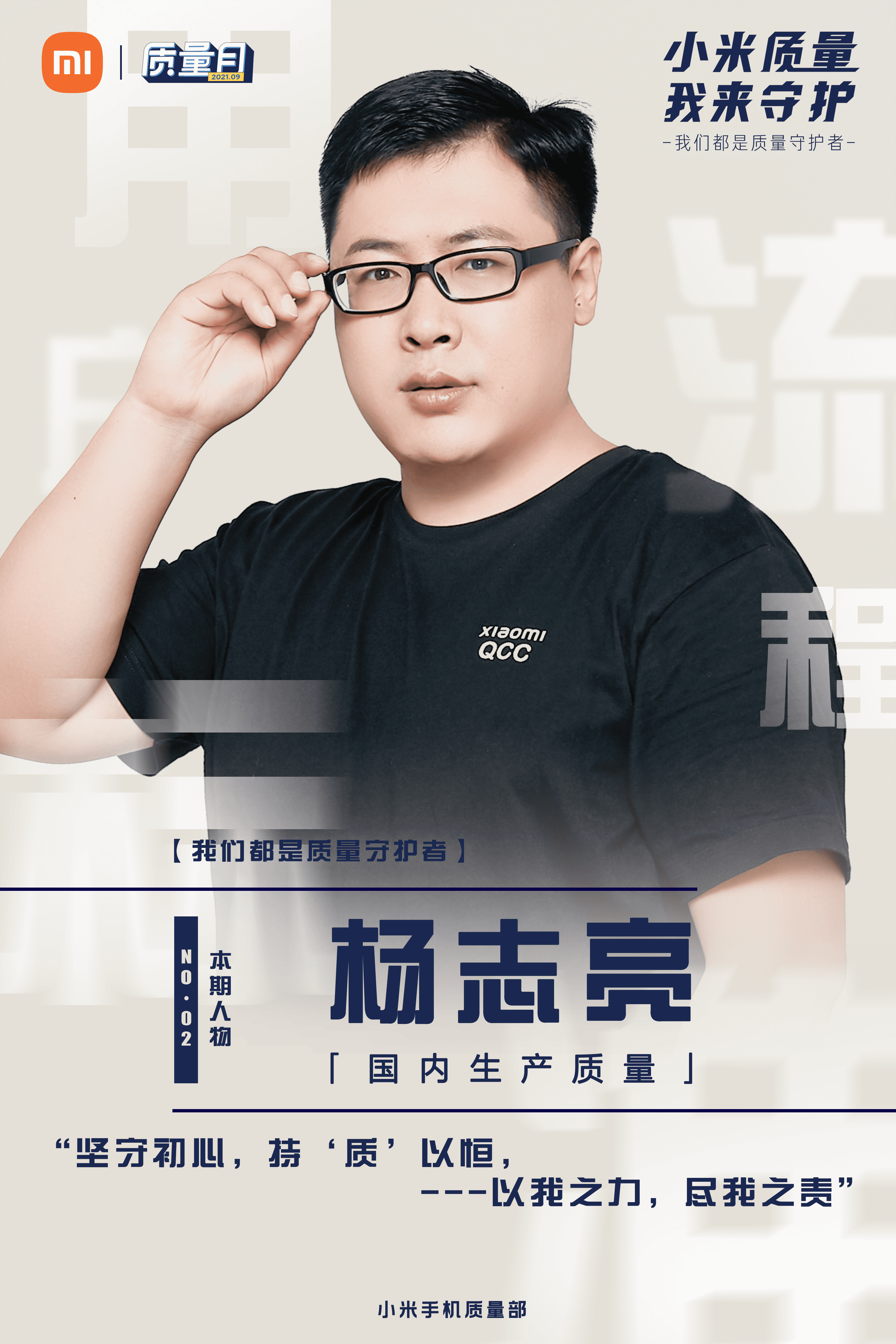
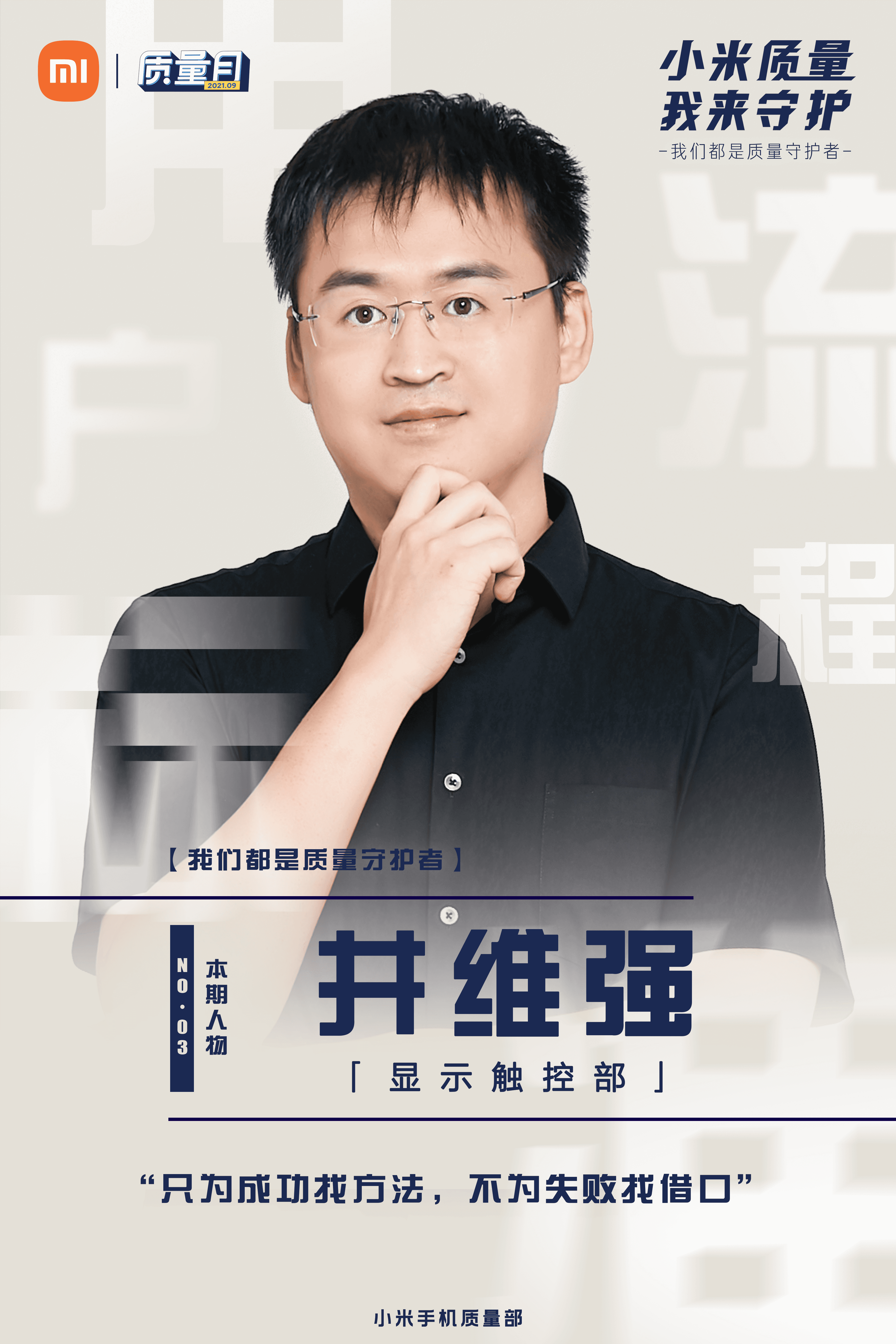
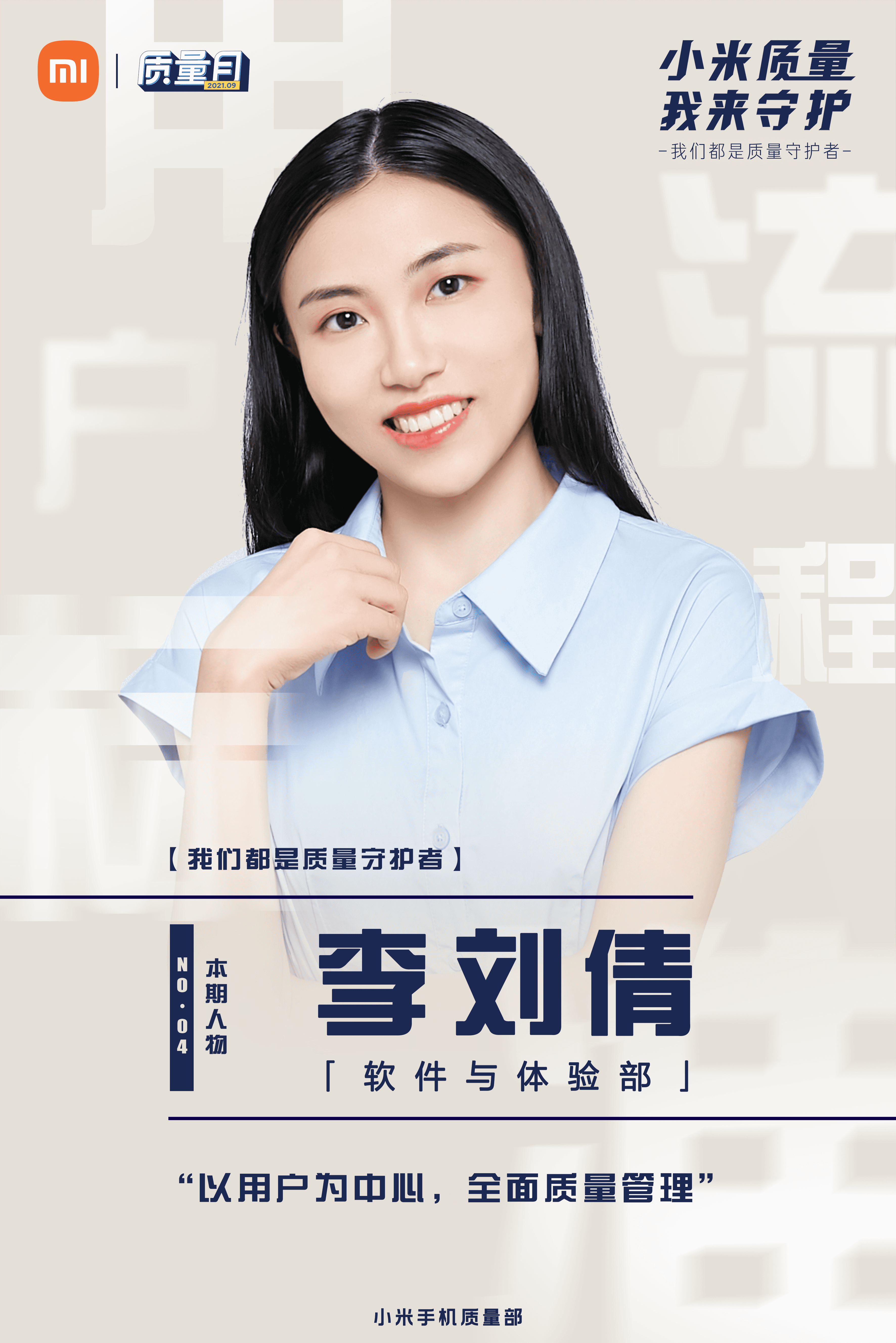
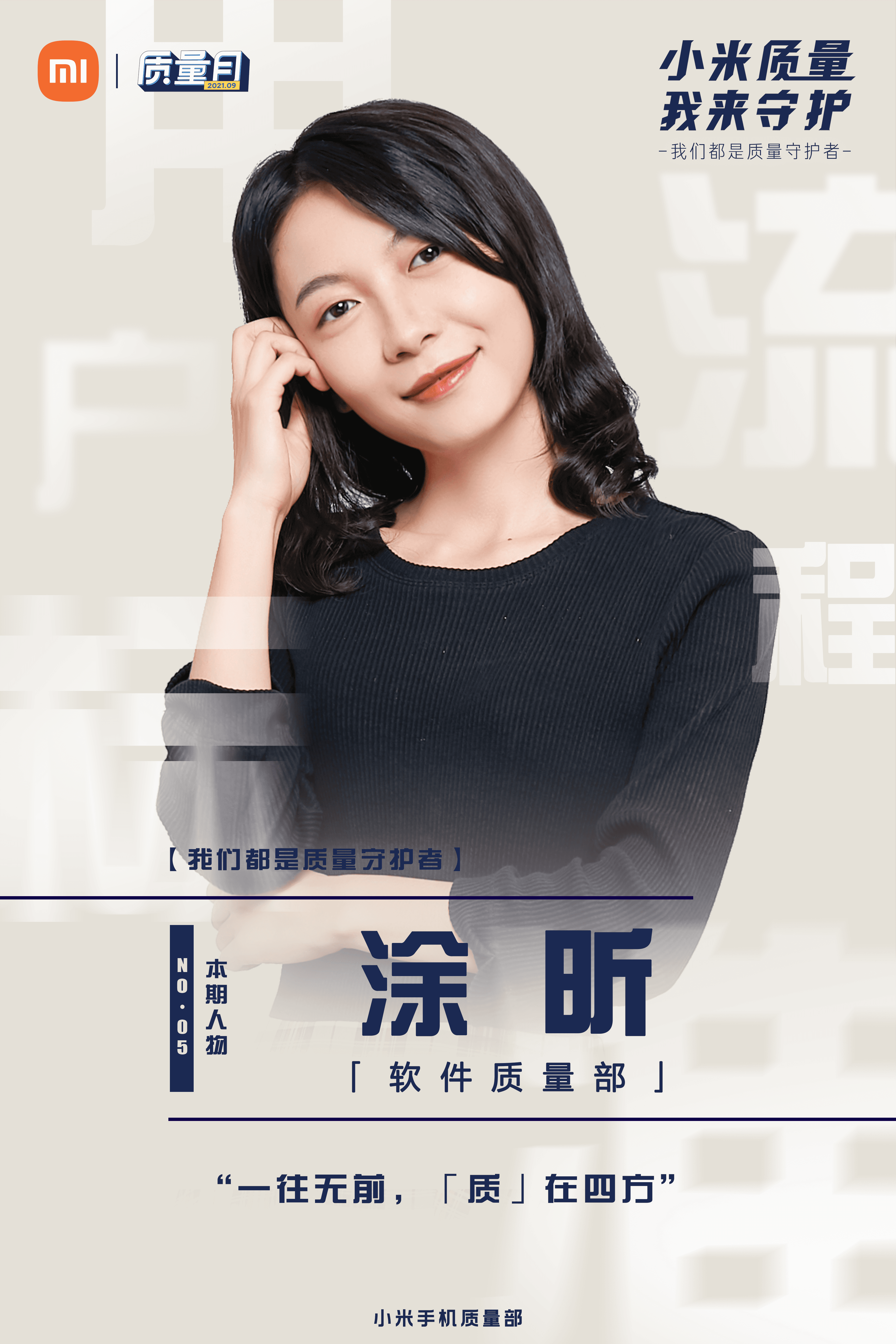

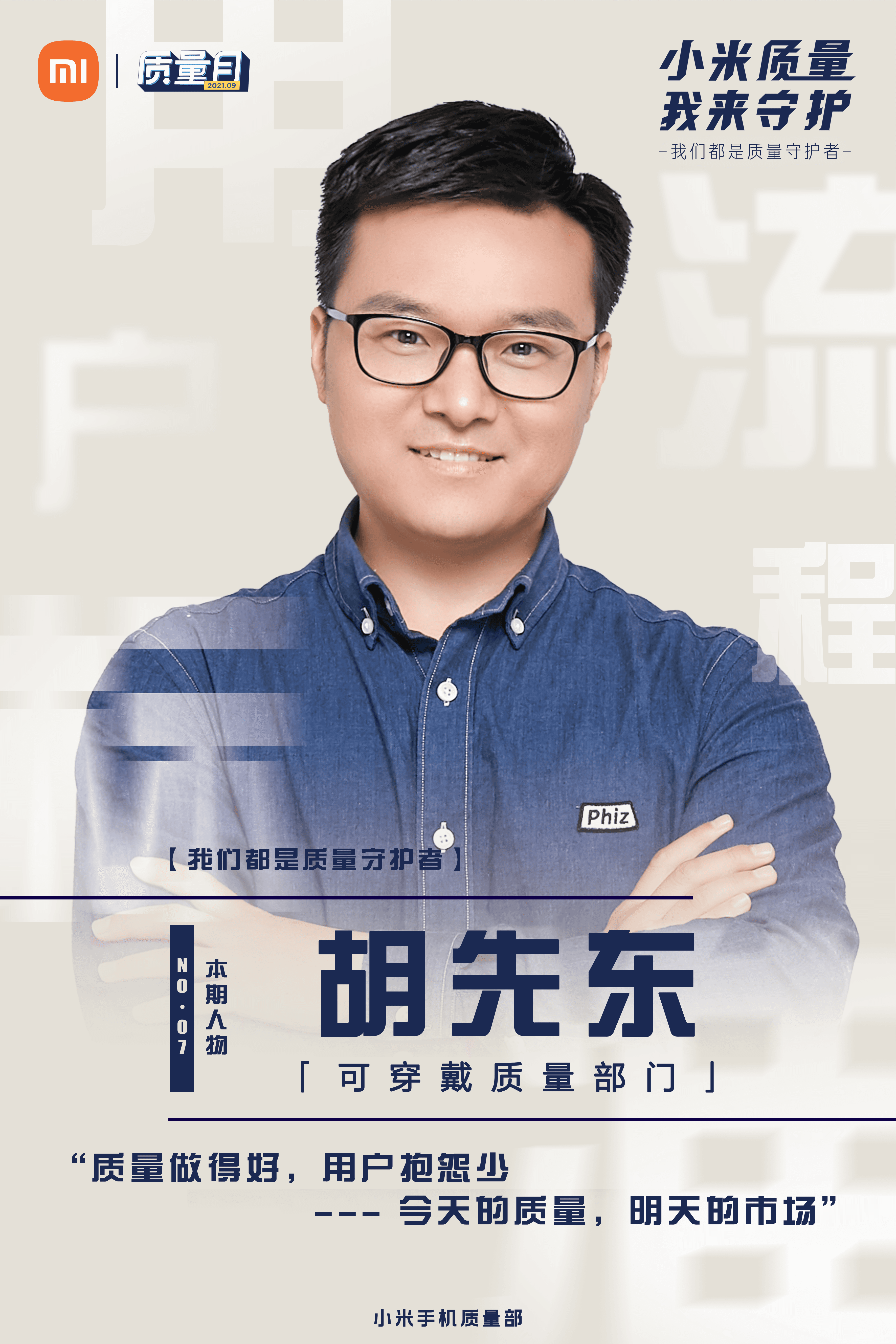
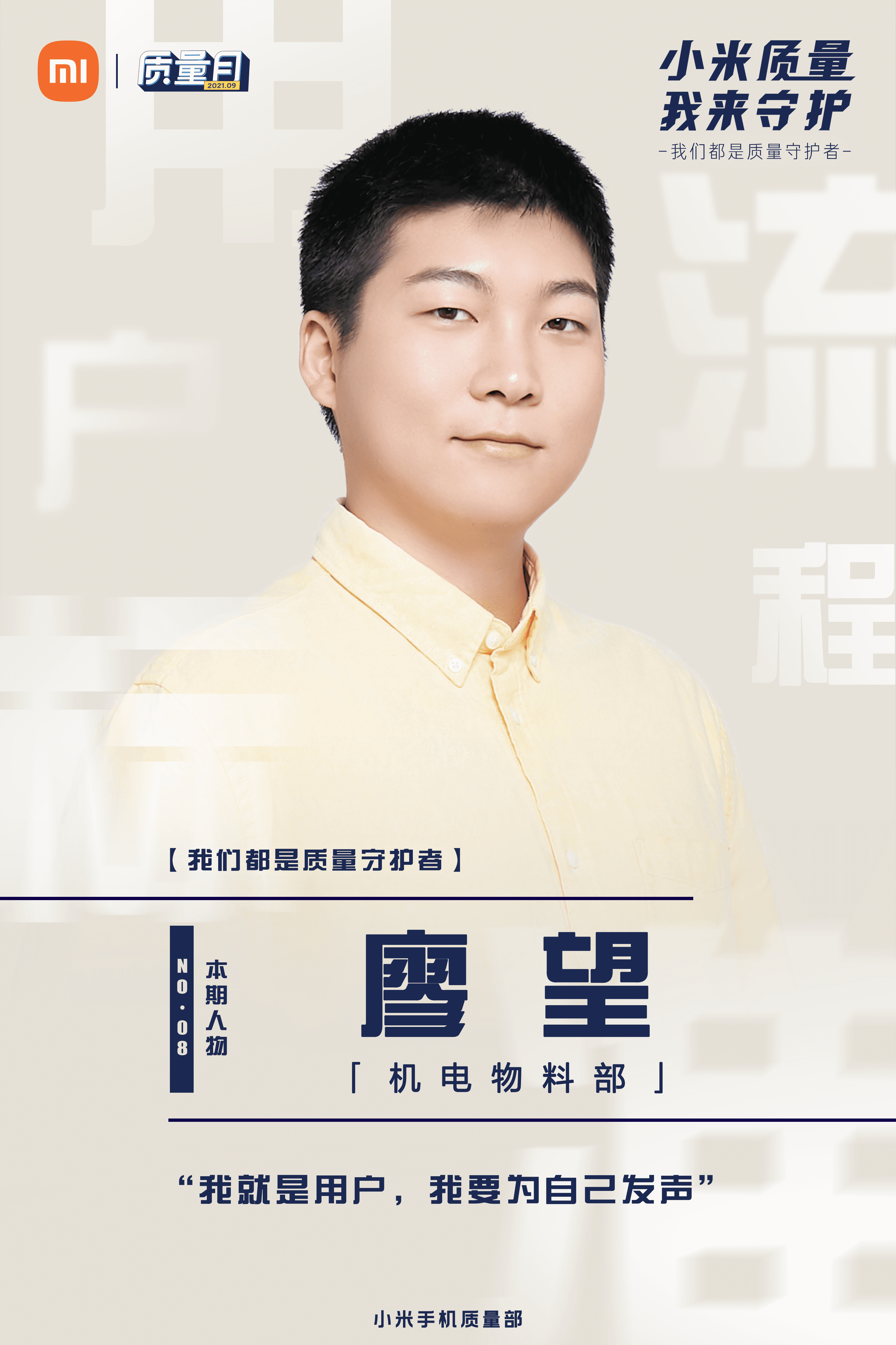
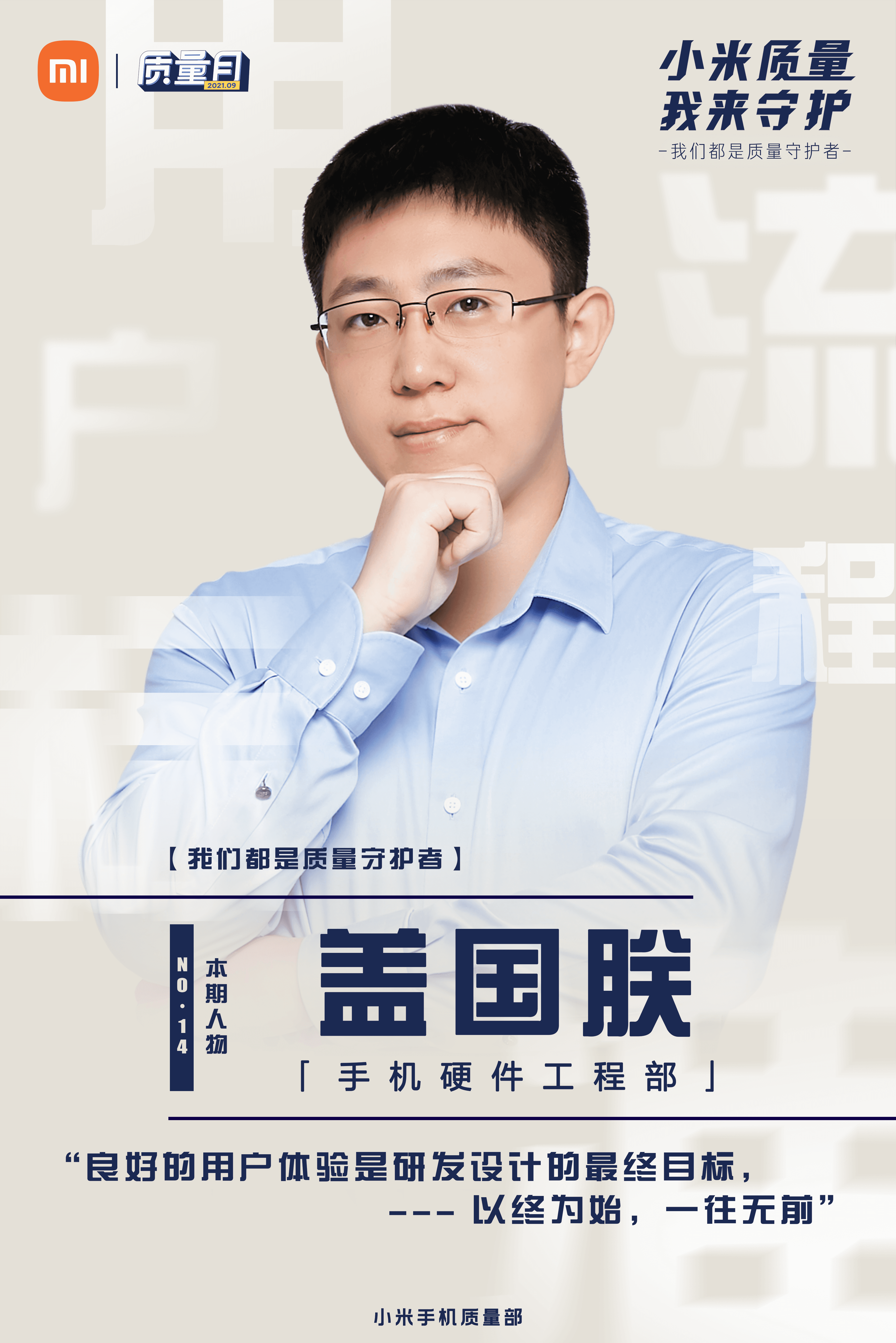
Highlighted individual quality contributors, using portrait-based layouts to make the campaign more personal and relatable.


